6 Ways to Use LinkedIn Carousel Posts to Supercharge Your Content Marketing
Wondering how to showcase your products or services more effectively on LinkedIn? Want an engaging way to share thought leadership or how-to content?
In this article, you'll learn how to create a LinkedIn carousel post from your company page or personal profile and find examples to inspire your next post.
What Are LinkedIn Document Posts vs. LinkedIn Carousel Posts and Why Should Marketers Care?
LinkedIn carousels are a type of interactive content featuring multiple slides. Although carousels can certainly display photos, most include a series of graphics with a mix of text, images, photos, screenshots, and infographics. Users can swipe (on mobile) or scroll (on desktop) to view the content in full. Think of them like a slideshow—but much more engaging and actionable.
Are LinkedIn documents and carousels the same thing? Yes and no. In July 2022, LinkedIn announced the launch of carousel posts, a new format designed to support multimedia. But if you've never seen one of these in your feed or if your account doesn't have the feature, you aren't alone. As of April 2023, this content format still hasn't rolled out to many users and isn't widely available.
Regardless of what you call them, people who are ready to implement carousels in their content strategy when the feature fully rolls out will have an advantage.
So when most marketers talk about carousels on LinkedIn today, they're really referring to document posts. Documents can include up to 300 slides and LinkedIn users can download them as a PDF to read or reference offline. They look and work just like carousel posts aside from two key differences:
- Carousels support multimedia, including video files
- Carousels autoplay, automatically leading users from one slide to the next
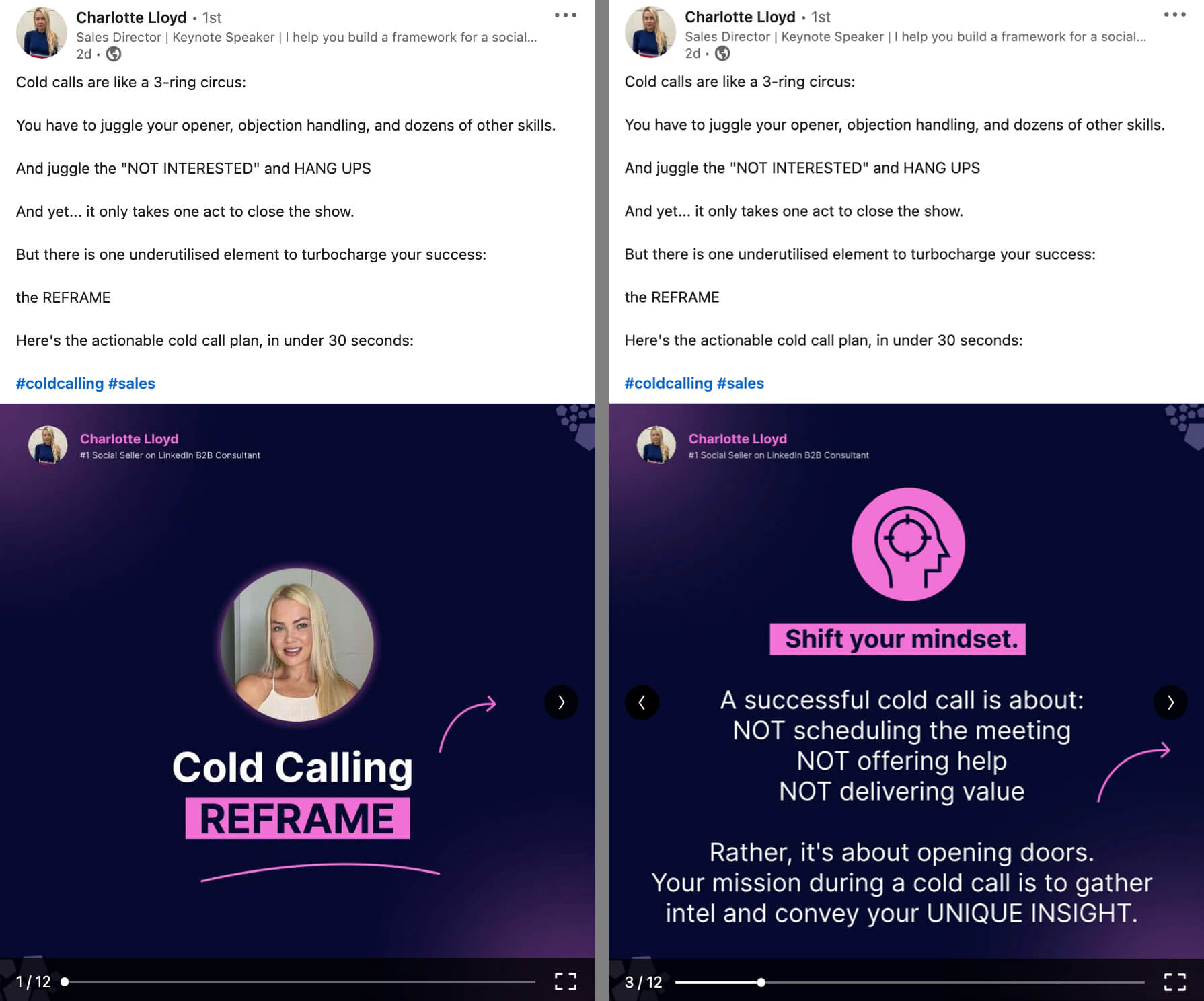
In the example Below, the document post by Charlotte Lloyd walks users through how to improve their cold-calling workflow. In 12 slides, the carousel walks users through how to structure a cold call including script suggestions and actionable tips.
Why are LinkedIn documents so important right now? When done well, this type of LinkedIn post can drive tons of organic engagement, which can lead to higher reach, thoughtful conversations with your LinkedIn community, and more opportunities for discovery outside of your current audience.
If your link shares, text posts, or native templates aren't driving the engagement you want to see on LinkedIn, it's worth experimenting with document posts on your personal profile or business page. Below, we'll explore angles and structures to maximize engagement.
How to Make a LinkedIn Document Carousel-Style Post
Whether you're creating your first carousel or you're looking for best practices, this walkthrough has everything you need to know about designing and publishing LinkedIn documents.
Design a Slide Deck
Start by building your slide deck. It isn't possible to design one in LinkedIn so use a third-party tool instead. The platform supports several file types (including PDF, PPT, and DOC) so you can use anything from a PowerPoint presentation to Google Docs to create a slideshow.
I like using Canva because the design app's library has some premade templates that offer good starting points for LinkedIn documents. Using Canva, you can also set up a template you can repurpose for each document, which is great for consistency.
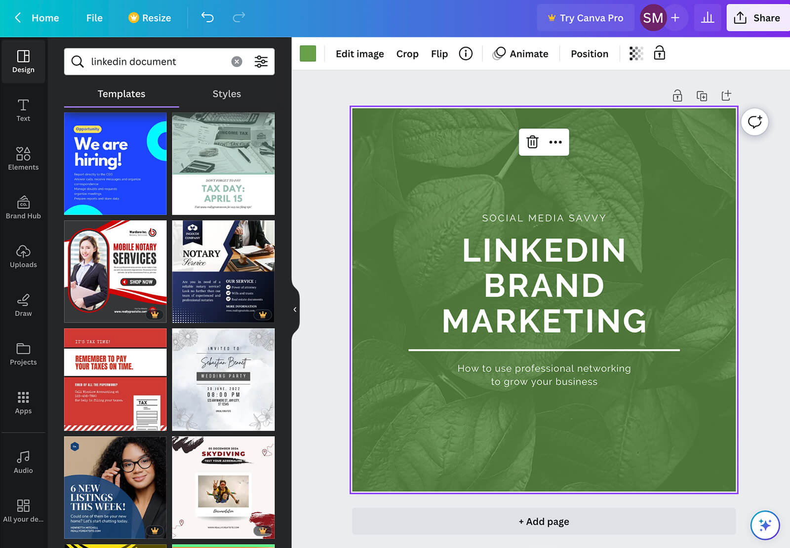
Although LinkedIn doesn't specify aspect ratios for documents, square and portrait formats are by far the most common. Both formats maximize available real estate in the LinkedIn feed on both mobile and desktop without looking like traditional documents or slideshows.
While LinkedIn document posts can support up to 300 slides, you don't necessarily need to aim for this limit. Documents can be as short as 2 pages, and most are fewer than 50 pages. Make yours as long as necessary to share the information you want to convey and ensure the file is no larger than 100MB.
Publish a LinkedIn Document Post
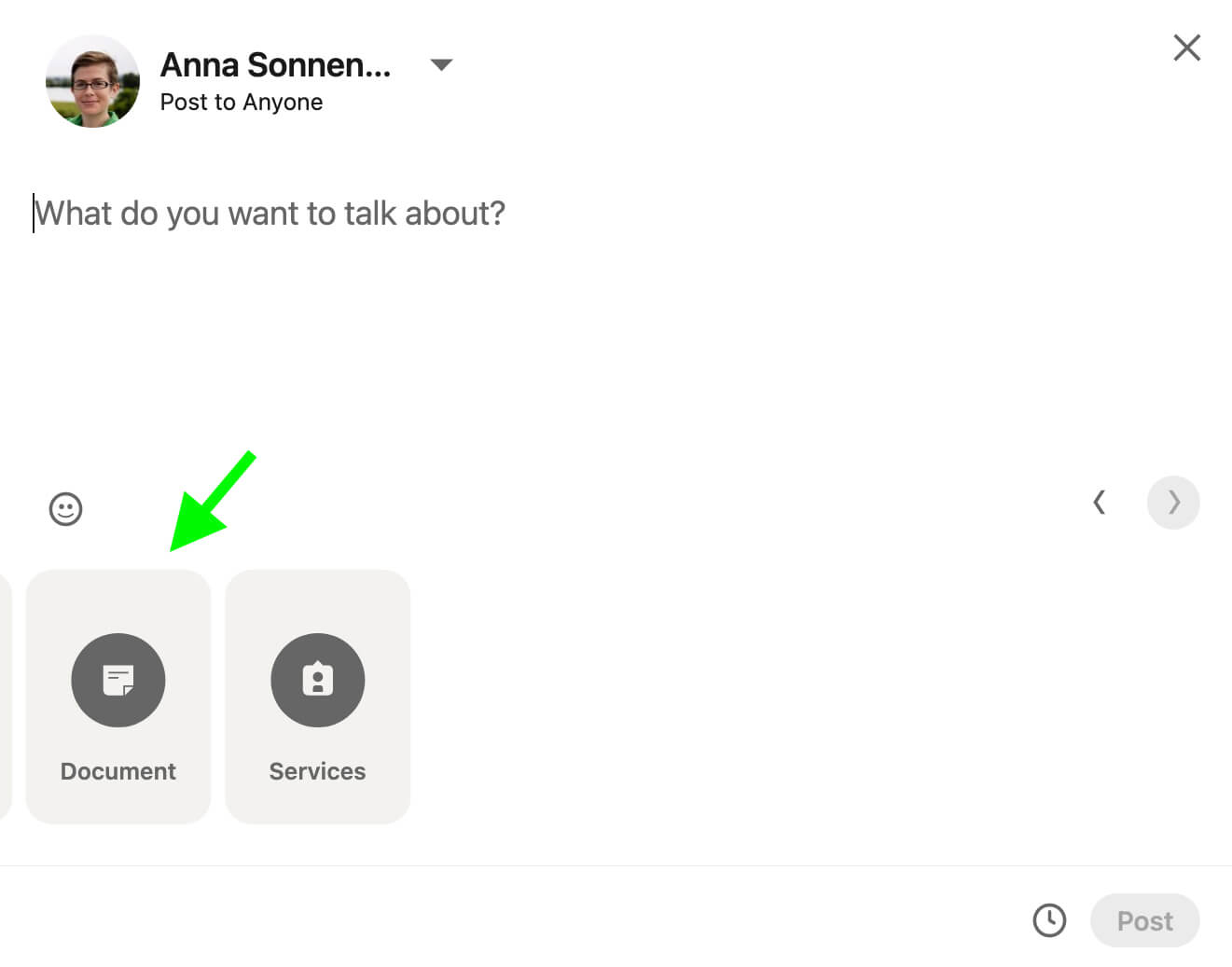
After designing a slide deck, you're ready to create a LinkedIn carousel. Open the post composer in a desktop browser or in the mobile app. Select the profile you want to post as (i.e., your personal profile or business page). Then select the Document option as the post format. On desktop, you may need to click More to display the full list of formats.
Next, upload the document you created. Give it a title, keeping in mind that the title will end up displaying along the top of the carousel. Click Done to add the carousel to the post and begin writing the caption.
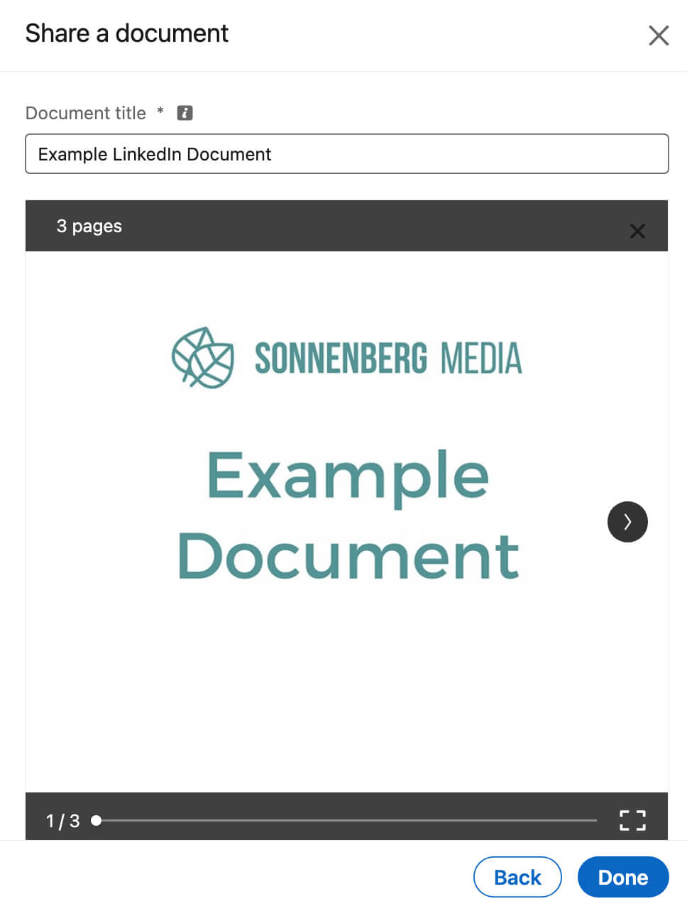
The caption is your opportunity to introduce the carousel and get your audience to swipe through. Use best practices like the following to get attention and capture interest:
- Add a hook to draw in your audience right away.
- Write short sentences that are quick to read.
- Break up lengthy lists with bullet points.
- Use line breaks to make content easier to consume.
- Include relevant hashtags to add context and boost visibility.
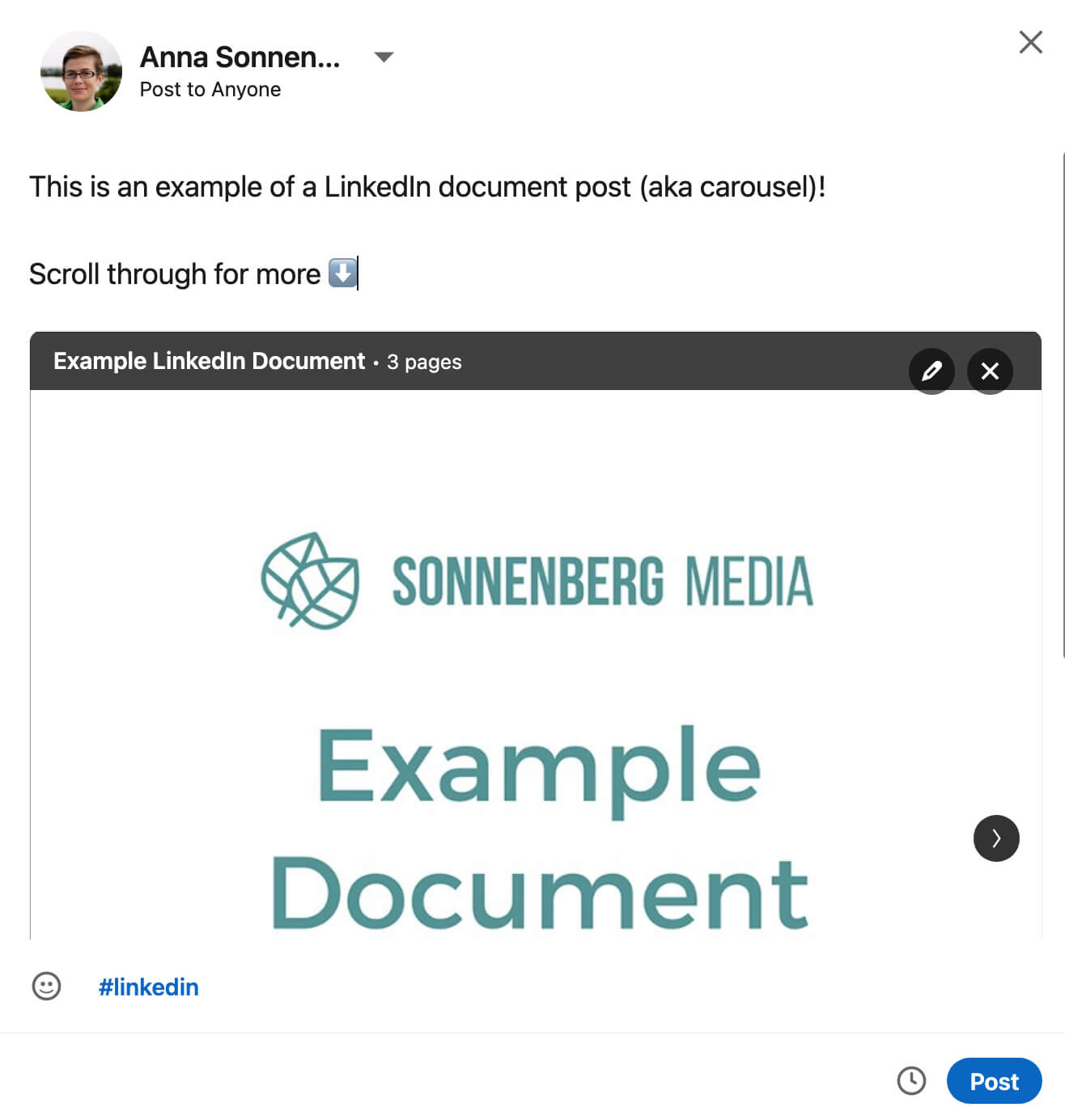
Like standard LinkedIn posts, document posts have a 3,000-character limit. Keep in mind that after about 100 characters, LinkedIn automatically truncates the caption and places the rest behind a See More link. So it's essential to include a compelling hook and any other critical information at the very beginning of the caption.
Once you've drafted the post, you can publish immediately or schedule it to go live later. To schedule the post, click the clock icon and select a future time.
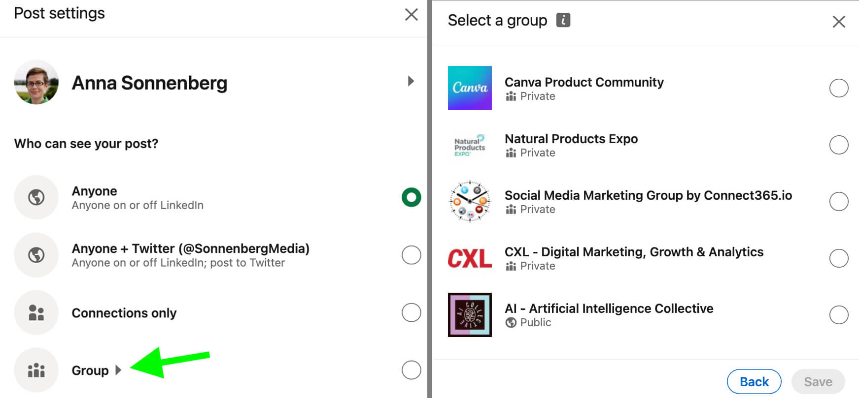
In most cases, you'll probably post to your personal profile or company page. But it's important to note that you can also publish carousels to LinkedIn groups. You can choose a group at the very beginning of the post creation workflow by clicking the drop-down menu next to your name, selecting Group, and picking a relevant group.
11 LinkedIn Post Ideas to Create LinkedIn Document Carousel-Style Posts That Resonate
Now you know the basics of creating document posts. But how can you make content that truly resonates with your target audience and helps you reach your key performance indicators (KPIs)? Use the best practices and examples below to guide your content creation.
#1: Start With an Eye-Catching Visual
When a carousel displays in the LinkedIn feed, only the first slide is visible. That means this first slide is responsible for grabbing your audience's attention and holding their interest long enough to make them scroll through. Think of it as the thumbnail or cover for your content.
You certainly don't have to add a title slide. But a title is often a good idea, as it tells people what to expect and gives them a reason to swipe. The first slide can be especially helpful if it features a title or hook that's both compelling and easy to scan quickly.
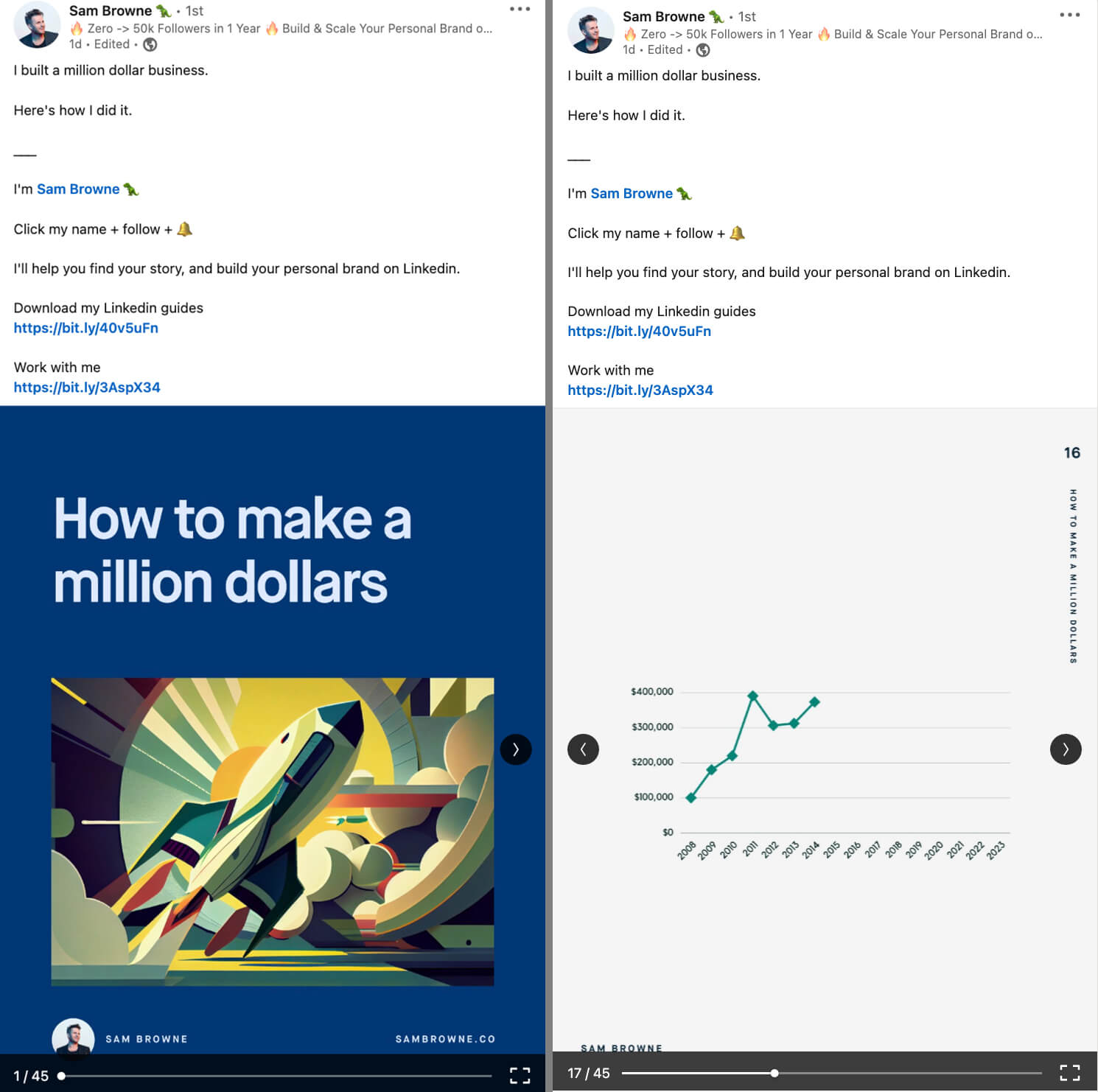
Below, the first slide of the carousel by Sam Browne features a rocket image and the bold statement “How to make a million dollars.” Together, the eye-catching graphic and intriguing title are pretty tough to ignore.
#2: Add Branding to LinkedIn Carousels
In most cases, you probably wouldn't add obvious branding to the photos you post on LinkedIn. So why is it so important to add a logo or LinkedIn profile image to LinkedIn carousels?
First, LinkedIn members can download carousels as PDFs. If users opt to download your carousel and file it away for later, you'll want to make sure they know who created the content. Branding and contact information—like in Sam Browne's carousel above—can help. Think of them like an eBook.
In addition, branding can help LinkedIn members recognize your content in the feed. If you use the same template, color scheme, and logo or profile picture in every document, users will be more likely to spot your content as they scroll, and hopefully stop to engage.
#3: Create a Clear Call to Action
It's easy to assume that getting LinkedIn members to scroll through the slide deck is the ultimate goal of a carousel. But in most cases, document posts can help you achieve much bigger outcomes.
Just like you would with a link share, text post, or LinkedIn template, decide on a goal and create a relevant call to action (CTA) for every carousel. In addition to including the CTA in the caption, reiterate it at the end of the document.
Below, the post by Ben Goodey shows users how to create an SEO content brief by sharing tips from industry leaders. However, the document doubles as a teaser for a paid product: an SEO content brief template.
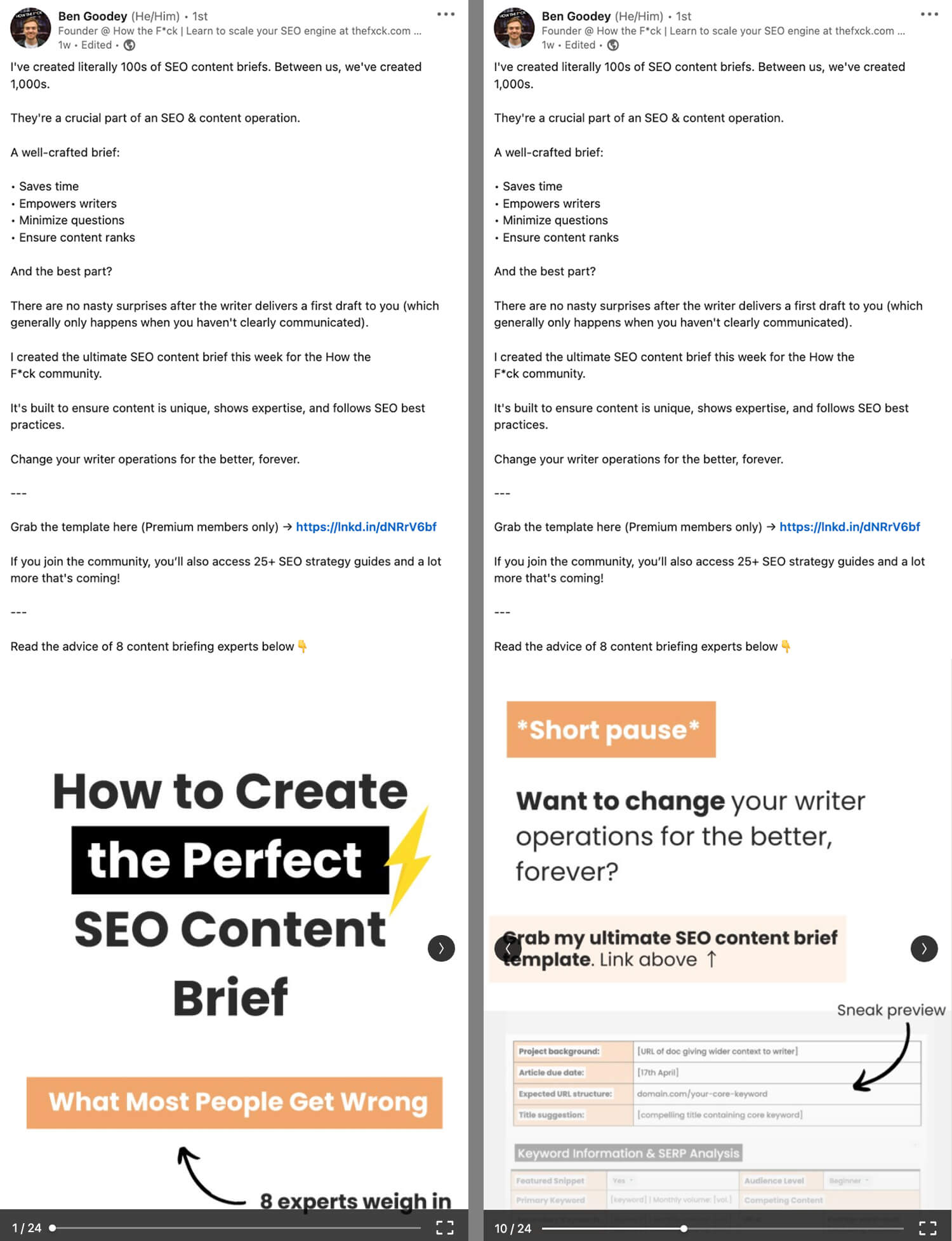
The caption includes a CTA prompting members of the creator's paid community to download the template. But just in case they don't read the CTA in the caption, the document includes a clear CTA, too. Rather than putting the CTA at the end, the creator places it in the middle of the document, where more users are likely to see it.
#4: Share Thought Leadership
LinkedIn carousels are also ideal for sharing your own (or your company's) thought leadership. That might look like compiling your unique thoughts on a topic or sharing your vision for the future of your industry. It might also look like sharing a strategy to resolve a complex problem.
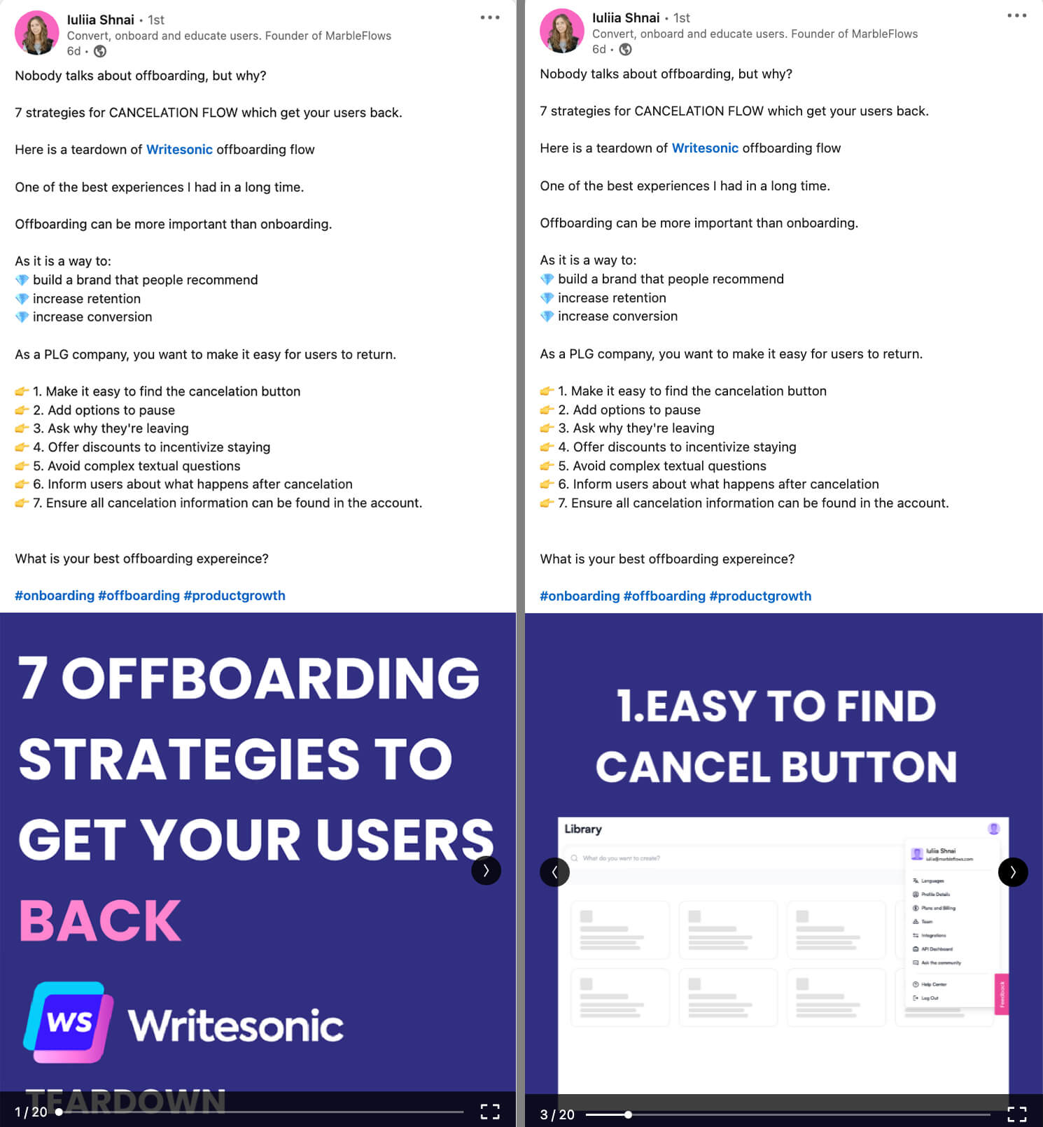
In the example Below, Iuliia Shnai shares strategies for user offboarding, which she identifies as an underrepresented topic. The carousel includes a teardown of a software platform's offboarding process, including notes about where the process usually goes wrong and observations on how Writesonic executes well.
#5: Highlight Industry Trends
As a thought leader, you (or your company) have to stay on top of what's happening in your industry. You can share your vision and insights by analyzing the trends you spot or the data you've collected.
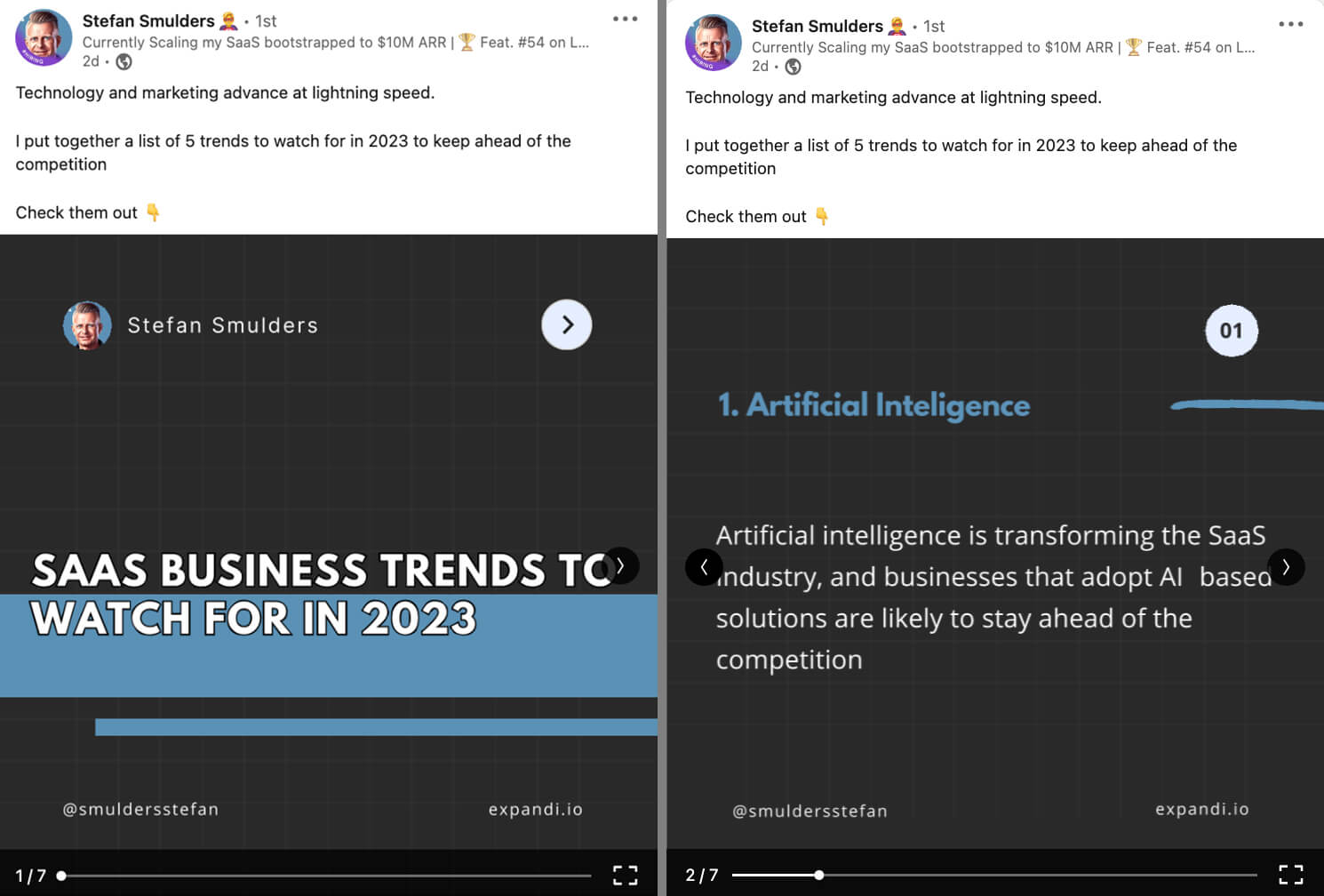
Below, Stefan Smulders shares business trends that leaders in the software as a service (SaaS) industry should know about. Each slide includes a discussion of a growing trend, followed by a final slide with a CTA.
#6: Compile Customer Stories and Case Studies
LinkedIn document posts also work well for visualizing data from your customers or clients. You can use them to share user-generated content, detail case studies, or promote customer stories.
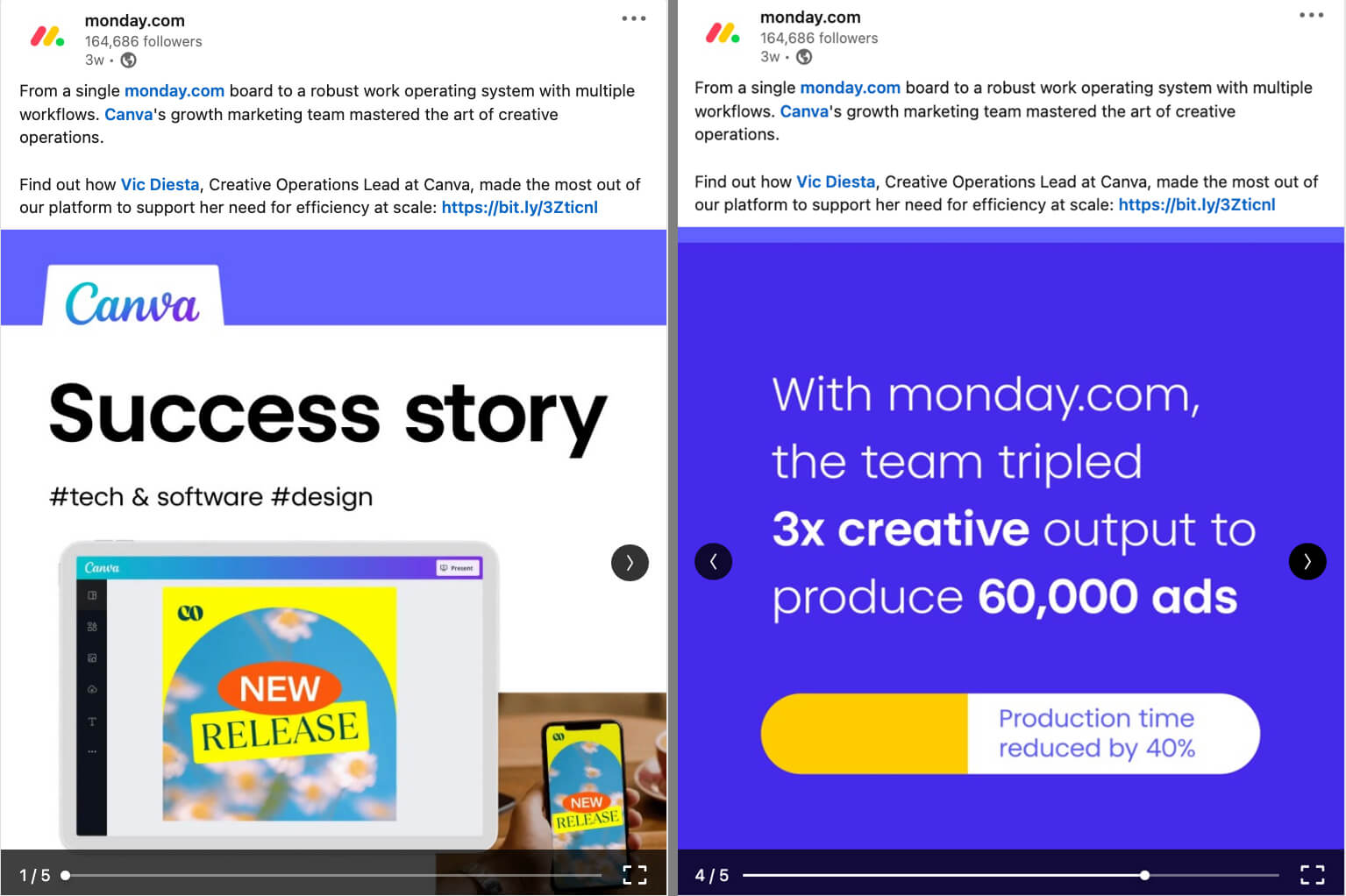
The carousel below features a customer success story. The document post details how the Canva operations team uses the work operating system to manage projects more efficiently. The slide deck includes data to quantify the customer's results and the caption includes a link to more details.
#7: Teach Users to Do Something
Carousel posts are ideal for showing LinkedIn members how to accomplish a task or master a skill. Once you break down the process into steps, you can highlight each on its own carousel card.
Below, the Lavender carousel post features a step-by-step framework for writing a cold sales email. Each card is a screenshot of a tweet, which is a great way to repurpose a successful Twitter thread.
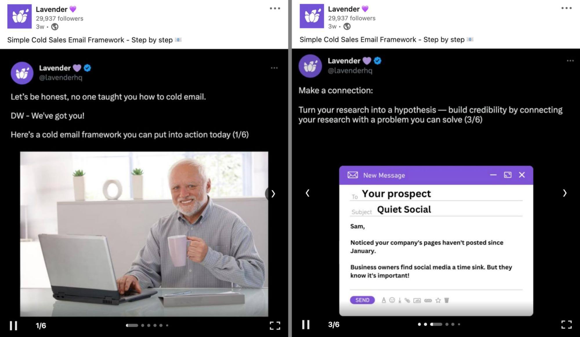
Note that the Lavender post uses LinkedIn's carousel post tool (rather than the document post tool). Users can click through it manually but it also plays through the carousel cards automatically. Because the autoplay function displays each card for just a few seconds, it's especially important to keep the text concise and the messages straightforward.
#8: Repurpose Blog Content
If you regularly share your company's blog posts to social media, you know that link shares don't always drive engagement or traffic at the level you expect. Document posts can help you distribute blog content in a more engaging way.
For example, you can break down a blog post into key points. Then you can summarize each on a separate carousel card. Alternatively, you can repurpose blog posts by using carousels to tell stories or share lessons.
#9: Showcase a New Product
Have a new product or feature to introduce to your audience? Document posts are helpful for launching software products, as the format is great for showcasing multiple features or highlighting benefits.
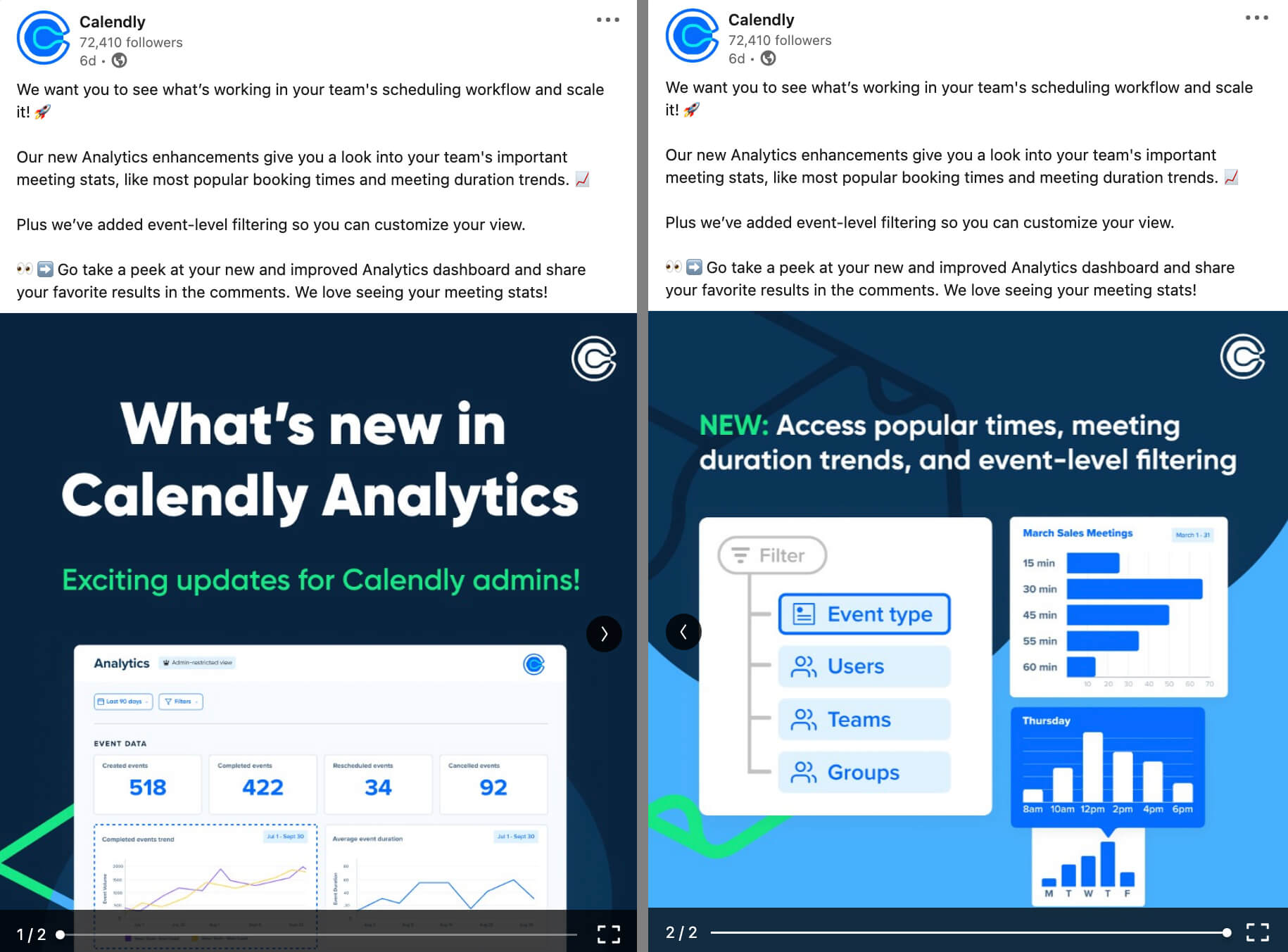
Below, the Calendly post announces new analytics features for the scheduling platform. The first slide uses an attention-getting title, and the second slide details some of the most exciting new features.
#10: Promote an Offer
LinkedIn document posts also work well for promoting limited-time offers. You can use them to offer a teaser, share your knowledge, or highlight the features and benefits of the offer.
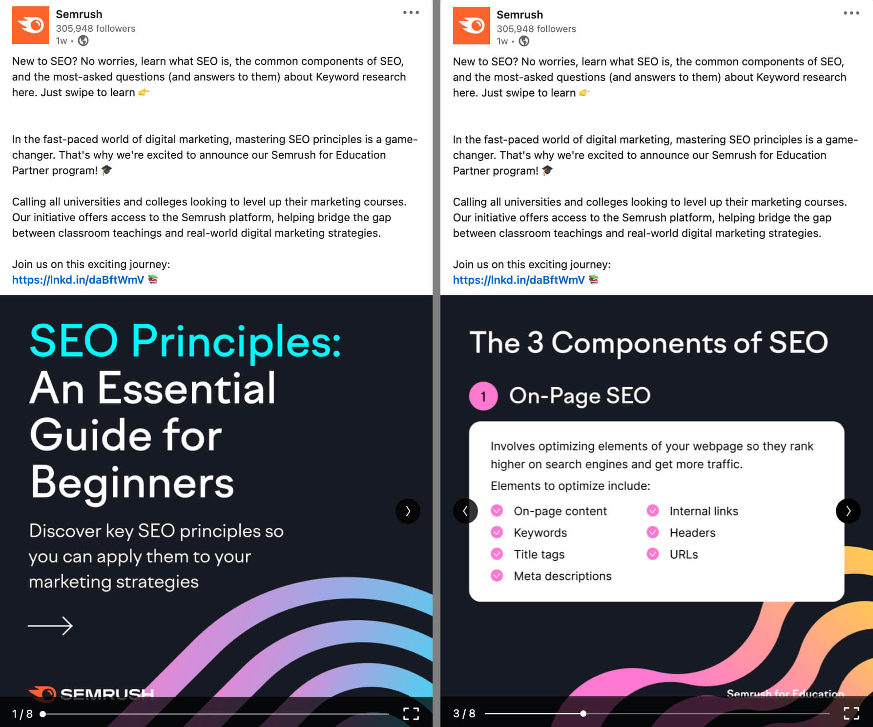
Below, the Semrush document post walks users through several key principles of SEO to showcase the brand's capacity for education. It fits seamlessly with the offer, which promotes partnerships with college-level programs that need to level up their courses.
#11: Sponsor Documents via LinkedIn Ads
Documents make excellent organic posts on LinkedIn but they can work just as well in paid campaigns. With document ads, you can let users access your valuable content directly or gate it behind a native lead form. If you go with the latter option, users will be able to preview a few pages before submitting a lead form.
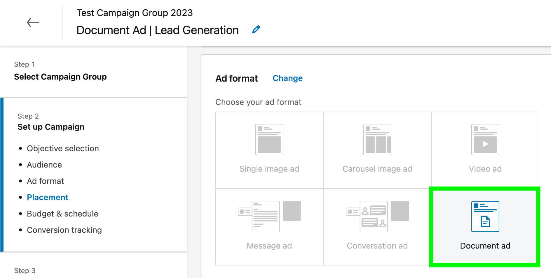
To advertise with a document-based creative, select Document Ad as the ad type in Campaign Manager. Then upload the document at the ad level. The specs are the same for paid and organic documents.
Below, gener8 uses a LinkedIn document to promote a white paper with original research. Users can preview up to three pages of the document in the feed. To download the document in full, they have to provide their contact information via a LinkedIn lead gen form.

Conclusion
LinkedIn carousels are ideal for sharing your knowledge, teaching your audience, and highlighting trends from your industry, making them great for building corporate and personal brands. With the best practices and examples above, you can create high-performing document posts that spark conversations and build trust.
Comments
Post a Comment